25 Revolutionary Logos from Past Trends
A company's logo is the first thing that comes to a person's mind when they hear the brand name..
It is vital to make the logo attention-grabbing as a customer remembers the brand every time they come across a similar shape of the logo or color scheme. If you look at the top startups for inspiration, their logos range from using bright colors to minimalism effectively. Here is a list of the 25 top logos that effectively used various design elements to draw millions of customers.
Bright colors and bold letters
Bright colored logos have ruled the past trends and make their way into the modern logo world again with their luscious style and eye-capturing beauty.
1. NASCAR
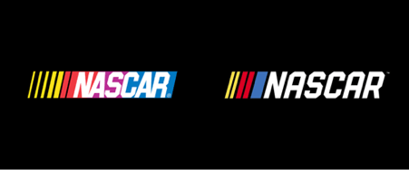
The original Nascar logo stayed unchanged for forty years since 1976, featuring the four bright colors and the bold letters in a contrasting background. The new logo introduced in 2017 retained the three yellow, red, and blue lines and got rid of the purple to look more aesthetic and attractive to the young generation.
2. NBC
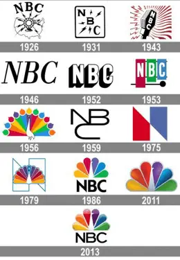
The National Broadcasting Company used mostly monochrome logos till 10953 and switched to the famous peacock design in 1956. They have been sticking to the logo since 1979 after a couple of changes. The final colorful and attractive peacock design got introduced in 2013 based on the logo used from 1986 with slight modifications in depth, giving a 3D effect to the logo.
3. FireFox
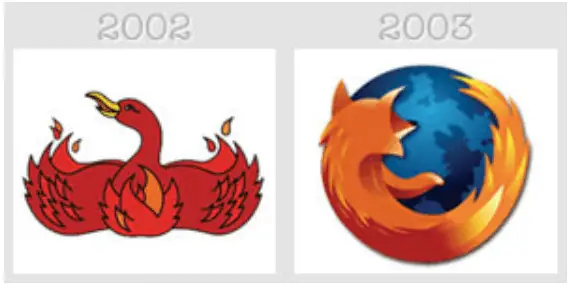
The colorful globe surrounded by the contrast orange fox logo of the Firefox browser is an excellent example of using colors effectively. The old FireFox logo represented the red bird with fiery wings and changed in 2003 to the current famous emblem that had remained unchanged for more than a decade.
4. Renault
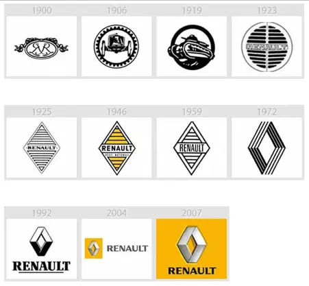
The Renault automobiles logo had undergone significant changes nearly six times before it switched to the current colorful logo. The original diamond and the name remain unchanged from 1925. The company tried to use the monochrome logo, with color, just using the diamond and finally settling on the current, famous, pleasant logo in 2007.
5. LEGO
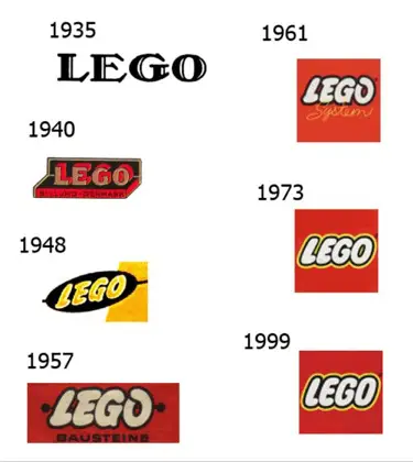
Lego is one bold company that experimented with colors right from 1946. Though their initial logo used a light blue tint, all other logos resembled the current one with a bright red background bold white letter. The current famous red background logo was designed in 1973 and is used to date without any change owing to its colorful and simple design attracting kids enormously.
Minimalism style
According to experts at Write My Dissertation, The minimalism style is one of the most used styles in the past two decades. Most of the famous start-ups keep their logo simple and minimal to differentiate themselves from others.
6. Apple
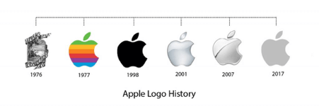
Apple logo had long been known for its colorful look. Steve Jobs initially quit the colorful design and introduced the blue and the black apples, which then changed into the now transparent ash apple design 2008.
7. Uber
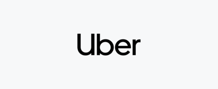
Uber is the simplest design used by recent start-ups, with just a simple font representing the name without additional drawing or color usage. Uber wanted it this way to distinguish itself from the others in the industry.
8. Nike
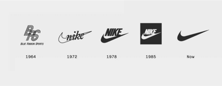
Nike has stuck to its minimalist design since its inception as it wanted an easy design to print on its shoes and make the customers feel they are making the right choice. The symbol combined with appropriate marketing garnered an enormous reach.
9. Airbnb
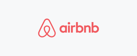
Airbnb logo and the name in a simple and easy-to-read font represent minimalism at its height. Like most of this decade's start-ups, Airbnb wanted something very simple yet catchy and attractive using minimal colors and came up with their logo after lots of brainstorming.
10. IBM
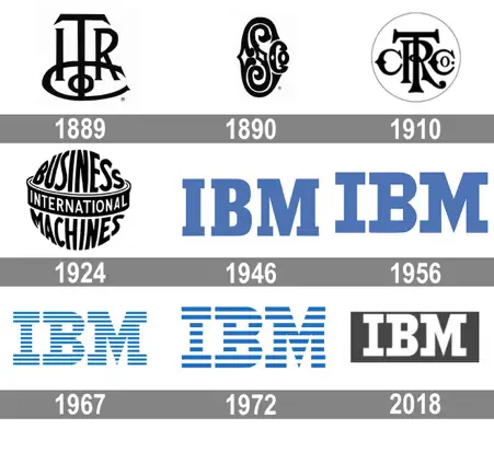
IBM had tried everything in its logos, from using incredibly stylish typographies to sophisticated logos. They settled on minimalism from 1947, and the current logo is in use since 1972 when it got altered a bit to add some color to the full black company name.
Typography based logos
Typography-based logos make fantastic monograms, and many brands use various letters in stylish fonts to create impressive logos.
11. Louis Vuitton

The Louis Vuitton brand's logo combining the L and the V in the most stylish way is an iconic example of typography-based classic designs. The brand uses the symbol in several of its products' designs to distinguish it from others and give it a sleek, luxurious feel.
12. Canon
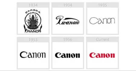
Canon uses simple words in a stylish way to make several people remember cameras automatically. The design lingers around minimalism but usually gets grouped under trendy typography logos due to Canon's customized name.
13. Estee Lauder logo
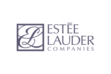
The combined E and L in monochrome and gold had undergone specific changes over the past decades and adorn the bottles of many high-end cosmetic items. The very symbol makes the people recognize the brand as luxurious and costly.
14. Vogue

Vogue, the most stylish magazine in the world, has kept its logo unchanged for years with simple typography of the name. A single font that looks extremely graceful when placed in any background created a great demand for similar-looking font emblems.
15. Animal planet
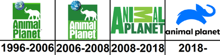
A simple blue elephant and a beautifully styled channel name, in the end, is the current Animal Planet logo, praised by various logo companies for its elegance. Animal Planet has experimented with texts for decades, placing them in multiple angles, and the new logo is simple and highly attractive.
Geometric logos
Geometric shapes like simple squares, rectangles, and circles can create impressive logos. Here are five famous brands that just used the kindergarten shapes without much change to create a lasting effect on the customers’ minds.
16. Target
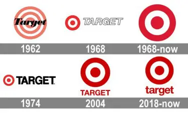
Target’s red and white circles are well known to all, and this simple geometric design inspired many other companies to try various shape-based logos. Target and the bullseye type logo in bright red and white was a major hit among the customers.
17. Adidas
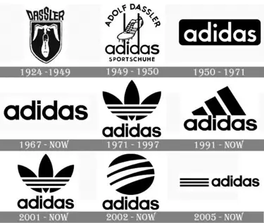
Just use lines across the foil leaves or place a slanted rectangle in different sizes, and Adidas symbol is created. The company explains it stressed three to indicate its services were available in North America, Europe, and Asia.
18. Microsoft
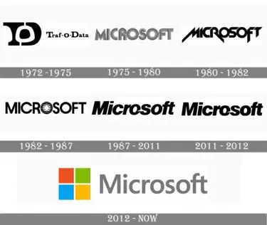
Microsoft’s four colored squares sure underwent specific changes and got some bendy curves. But, the initial design remains the same, proving the power of geometry-based logos. The four simple squares in various colors automatically reminded the customers about “Windows” and the colors about their versatile services.
19. Audi
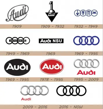
The Audi symbol uses just four rings or circles intertwined with each other to indicate the merger between four companies during the 1932 economic slowdown. Reminding the customers about the Olympic rings, the symbol represents how geometric symbols can be used effectively without any alteration as a logo.
20. Cisco
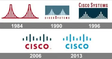
The Cisco logo consists of some simple lines in various sizes and the brand name below it. The stripes represent a frequency and connection between the past and the future in today’s logo. But, it represented the Golden Gate Bridge in San Francisco till 1990.
The most Amazing logos of all time
Some unforgettable logos will remain in our memories for several more decades due to their stunning features like exclusive color combination and design.
21. Warner Brothers
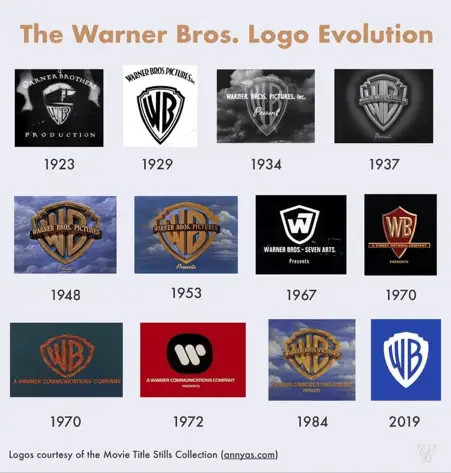
The classic Warner Brothers logo with a shield and the golden letters of WB engraved on it will remain in every cinema lover's mind. Though the emblem underwent various changes in the past century, its basic design remains unchanged due to the enormous fan love.
22. Givenchy
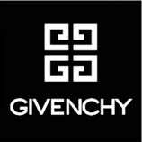
The Givenchy logo is considered one of the best in the industry, with one single shape placed in four different directions. The logo can be regarded as geometric and minimalistic and is one of the most praised logos in history.
23. McDonald's
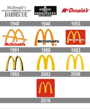
Who would forget the bright red and yellow McDonald's logo and the immense joy it bought into our kid life. The curved yellow M and the red background remain mostly unchanged since 1975, making the symbol an excellent example of bright colors and big letters.
24. Mastercard
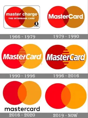
Two simple circles in contrasting colors and some lines automatically make us think of money, credit cards, and purchase. The Master Card logo designed by Robert Leavelle has remained mostly unchanged since 1990, with only slight touchups, and serves as an excellent example for geometric logos.
25. Starbucks
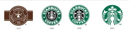
The Starbuck mermaid logo with its floating hair became an inspiration to a plethora of pencil drawing-based logos creating a great stir in the industry when it was introduced. Using just two colors, Terry Heckler captivated the mind of millions through his sketch.
Final Thoughts
Logos represent a brand, but they are associated with many marketing techniques and ads that bring a smile to the customer's face. Simple, brightly colors, shaped based or stylish, whatever the type may be, the vital factor is that the logo should bring a smile to the customer's face and make them remember the brand fondly when they see the logo anywhere. If you enjoyed this Mod, you might like to read more about these 8 Digital Marketing Lessons To Scale Your Brand in 2021! Please share this Mod with your friends, family and colleagues via the social links below.

Michael Gorman
Michael Gorman is a renowned freelance essay writer and proofreader from the UK currently working for a custom essay service. He is a professional blogger and is well-known for his study software reviews and paper writing services reviews. He is interested in various subjects and shares his knowledge with college students through his blog and podcasts. Feel free to contact him on Facebook or Twitter.